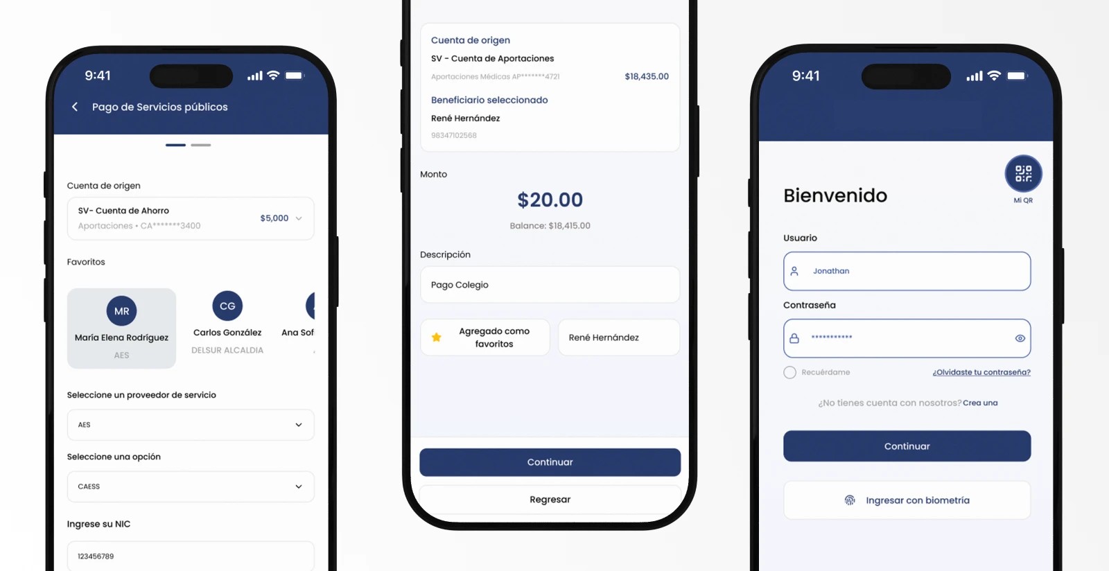
We recently finished a digital banking redesign for a financial cooperative in El Salvador, covering both its online and mobile banking. The previous platform worked, but its structure was confusing and made members’ daily tasks harder than they needed to be. Checking a balance or paying a bill took more steps than necessary, and finding each option depended on the user remembering where it was.
The goal was to rebuild the platform from the ground up, bring it to current digital banking standards, and make accessibility a priority rather than an afterthought.
The digital banking redesign challenge: keeping existing users
Replacing an online banking platform carries a risk that is not always obvious at the start. If users cannot find what they are looking for, they call the contact center, go to a branch, or simply stop using the digital channel.
2025 studies on digital banking adoption identify three main barriers: difficult interfaces, low digital confidence, and fear of fraud (Nature, Humanities & Social Sciences Communications). All three were present in this project.
To avoid designing blind, we started from a key proto-persona: a professional between 50 and 60 years old, with several active savings accounts, who uses banking for specific tasks and has neither the time nor the patience to decode a screen. Every design decision was evaluated with that person in mind.
Flows first, screens second
Before opening Figma, we analyzed the user stories. From them we built complete flowcharts for each process: what the user decides at each step, which paths they can take, and what happens when something goes wrong.
That groundwork organized the information architecture. By the time we reached the visual stage, every critical flow was already coherent, including error states, which are usually the first thing forgotten and the first thing that frustrates users.
A prototype you can use, not just look at
For this project we worked with an AI-supported workflow. We connected Figma to AI agents through the Model Context Protocol (MCP), which let us design and generate code at the same time.
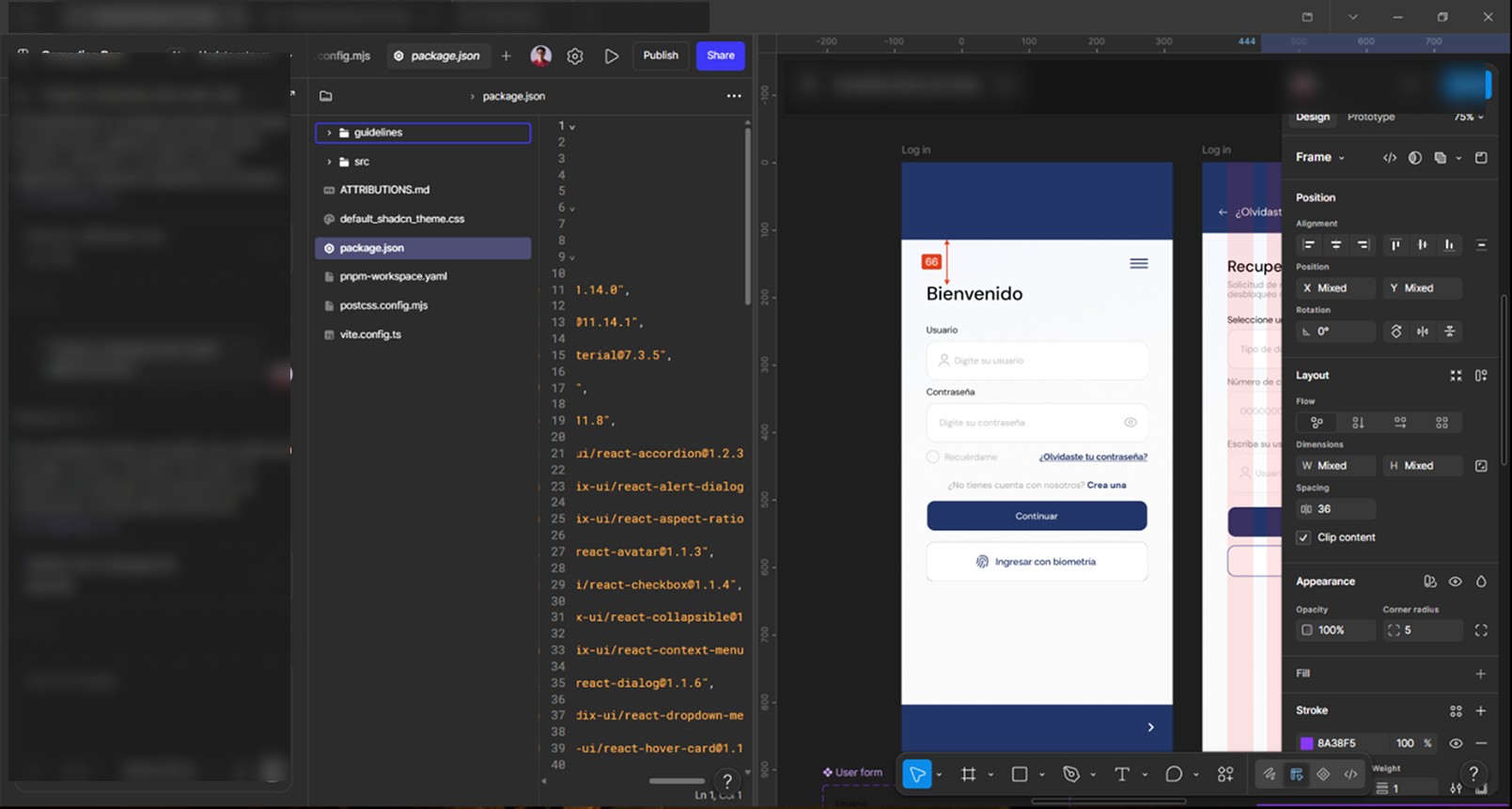
As a result, the client did not review a static mockup. They tested a functional React prototype, with screens that responded the way the final application would. That brought three concrete advantages:
- Faster feedback: the client walked through the flows in a real interactive environment and caught discrepancies early, before they reached development.
- UI validated in motion: designing and coding in parallel let us refine dynamic states and screen behavior as we went.
- Cleaner handoff: the development team received a solid front-end code base, which sped up implementation.
Interface decisions built for the real user
The user profile called for a clean interface, legible typography, and a visual hierarchy that did not overwhelm. Each screen shows what the current task needs and nothing more.
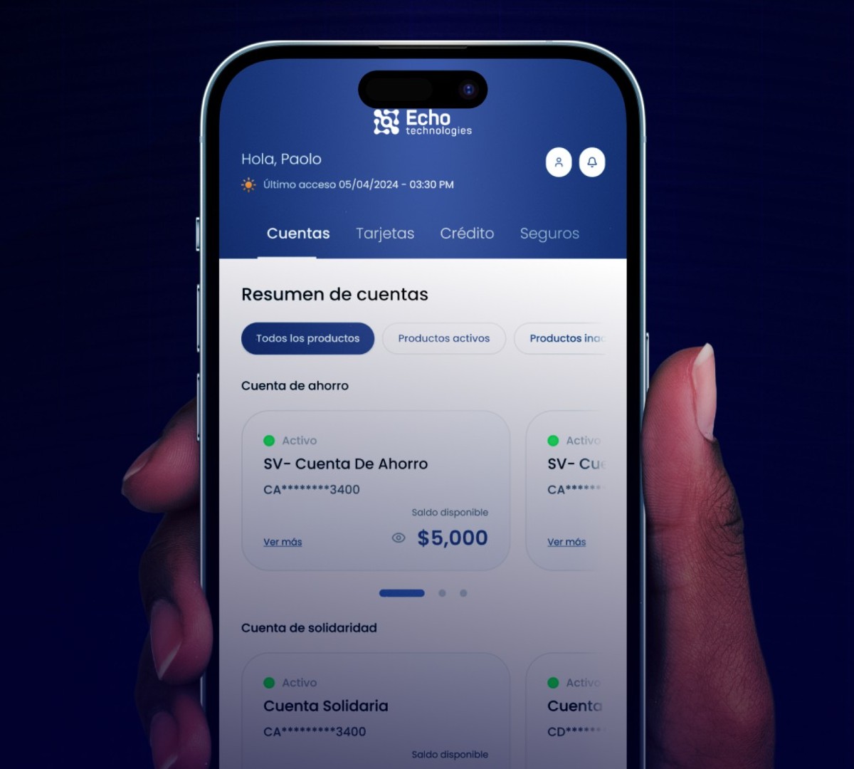
One of the most refined areas was how financial products are displayed. We built a card system that adapts to how many accounts the member has:
- One account: the card spans the full width to highlight the balance and quick actions.
- Two accounts: space is split evenly so both can be checked at a glance.
- Three or more accounts: cards are arranged in a carousel, so users are not forced into endless vertical scrolling.
Trust is also designed. Biometric login, beneficiaries saved as favorites, and clear confirmations before each payment reduce the sense of risk that holds many users back. The security that supports all of this behind the scenes deserves its own article, and it will be the next one in this series. In the meantime, you can read what it actually costs your bank to keep running on-premise and what AWS changes.
What users said
The new version received a very positive response. On Google Play Store, members highlighted its simplicity and clear navigation:
I’m genuinely impressed with this update, the app is visually spectacular and incredibly intuitive and functional, excellent work.
C. M., Google Play user
It’s excellent, more intuitive and easier to use, I love the new features.
N. M., Google Play user
Very intuitive and works great, I love it.
R. R., Google Play user
Reviews translated from Spanish.
What we learned from this digital banking redesign
- Designing for the most demanding user improves the experience for everyone.
- Flows and error states are solved before screens.
- A functional prototype shortens discussions with the client, because decisions are made on something that already works.
- Placing AI agents between design and development narrows the gap between what gets approved and what gets built.
Grounding every change in members’ real needs allowed us to turn a complex banking platform into a clear, modern, everyday tool. A redesign like this works best when it integrates cleanly with the core banking system and is part of a broader digital transformation plan.
Project snapshot
- Sector: financial cooperatives
- Platforms: online and mobile banking (iOS and Android)
- Tools: Figma, MCP, React
- UX/UI design: Paolo Valsee, Echo Technologies
If your online banking needs a renewal and you are worried about how your users will receive it, let’s talk.